OKI Productions Inc.
LOGO DESIGN & VISUAL IDENTITY
PROJECT OVERVIEW
OKI Inc. is a premier provider of innovative event services, proudly headquartered at the Ohio Fairgrounds and serving clients nationwide.
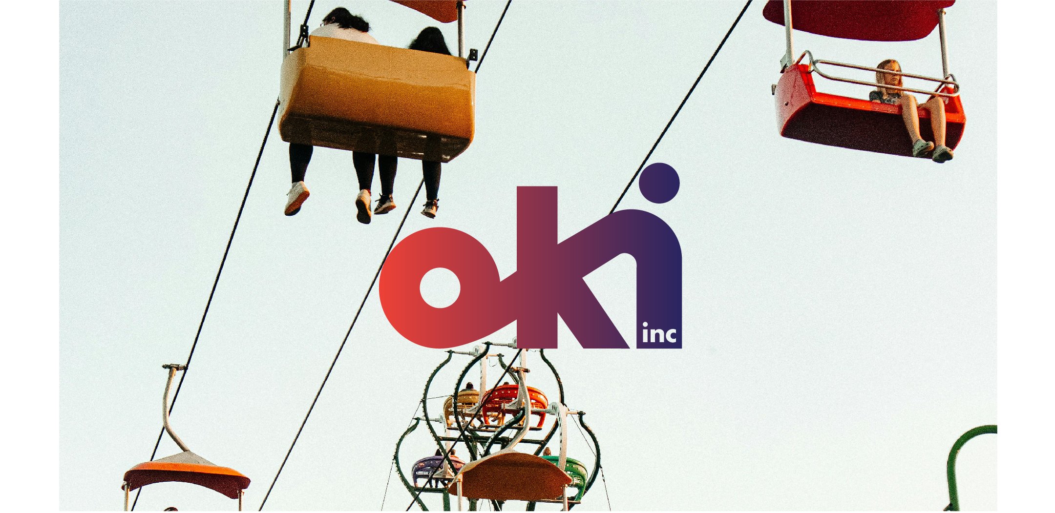
The logo centers on the OKI acronym, with letterforms designed to evoke the shape and excitement of a fair ride. A dynamic gradient flows through the letters, emphasizing motion and energy. The brand's color palette draws inspiration from the hues of a Midwest sunset, reflecting a spirit that's as bold and inviting as the events they create.
JELY SERVICES
Creative Direction
Visual Identity
Logo Design
Print Design
Website (in progress)


